
10 Lab: Unsupervised Learning
This is a modified version of the Lab: Unsupervised Learning section of chapter 10 from Introduction to Statistical Learning with Application in R (ISLR). This version differs from the ISLR lab in that it uses tidyverse techniques and methods that will allow for scalability and a more efficient data analytic pipeline. It also introduces code for clustering algorithms not discussed in that chapter.
10.1 Libraries
library(ISLR)
library(kernlab)
library(gridExtra)
library(ggdendro)
library(magrittr)
library(janitor)
library(skimr)
library(tidyverse)
10.2 Principal Components Analysis
For principal component analysis (PCA), we will be using the US Arrests dataset:
usar = read_csv("data/USArrests.csv") %>%
  clean_names()

usar %>% skim() %>% kable()| skim_type | skim_variable | n_missing | complete_rate | character.min | character.max | character.empty | character.n_unique | character.whitespace | numeric.mean | numeric.sd | numeric.p0 | numeric.p25 | numeric.p50 | numeric.p75 | numeric.p100 | numeric.hist |
|---|---|---|---|---|---|---|---|---|---|---|---|---|---|---|---|---|
| character | state | 0 | 1 | 4 | 14 | 0 | 50 | 0 | NA | NA | NA | NA | NA | NA | NA | NA |
| numeric | murder | 0 | 1 | NA | NA | NA | NA | NA | 7.788 | 4.355510 | 0.8 | 4.075 | 7.25 | 11.250 | 17.4 | ▇▇▅▅▃ |
| numeric | assault | 0 | 1 | NA | NA | NA | NA | NA | 170.760 | 83.337661 | 45.0 | 109.000 | 159.00 | 249.000 | 337.0 | ▆▇▃▅▃ |
| numeric | urban_pop | 0 | 1 | NA | NA | NA | NA | NA | 65.540 | 14.474763 | 32.0 | 54.500 | 66.00 | 77.750 | 91.0 | ▁▆▇▅▆ |
| numeric | rape | 0 | 1 | NA | NA | NA | NA | NA | 21.232 | 9.366385 | 7.3 | 15.075 | 20.10 | 26.175 | 46.0 | ▆▇▅▂▂ |
Recall that PCA pertains to continuous data, so we remove the state column from the tibble. The function that actually performs PCA is the prcomp() function. This takes a matrix or data frame as an argument. It also has an argument called scale, which tells re-scales the variables prior to computing principal components (PCs).
pr_out = usar %>%
  select(-state) %>%
  prcomp(scale = TRUE)
We can get the loadings for each PC from the rotation attribute.
pr_out$rotation## PC1 PC2 PC3 PC4
## murder -0.5358995 0.4181809 -0.3412327 0.64922780
## assault -0.5831836 0.1879856 -0.2681484 -0.74340748
## urban_pop -0.2781909 -0.8728062 -0.3780158 0.13387773
## rape -0.5434321 -0.1673186 0.8177779 0.08902432Here, we see that that the first PC is determined in equal parts by the crime types. However, the second PC largely depends on population.
We can visualize the PC rotation with the biplot function:
biplot(pr_out, scale = 0)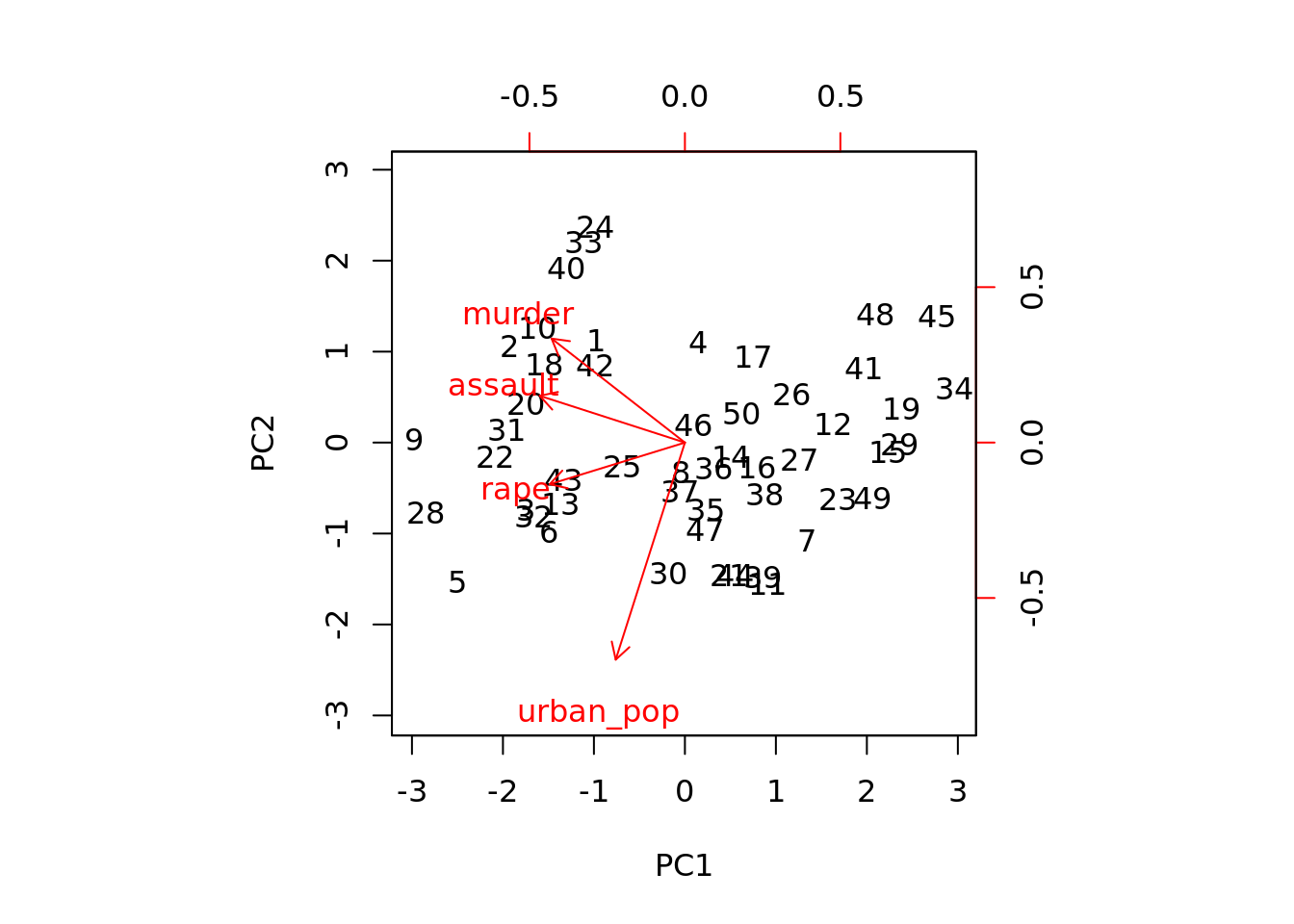
Finally, deciding how many PCs are useful depends on how much information they contain. This is often determined by the proportion of variance each explains. We can compute this from the sdev attribute of prcomp objects:
pve = tibble(component = 1:4,
             pve = pr_out$sdev^2/sum(pr_out$sdev^2))
We can plot the proportion of variance explained:
ggplot(pve) +
  geom_line(aes(component, pve))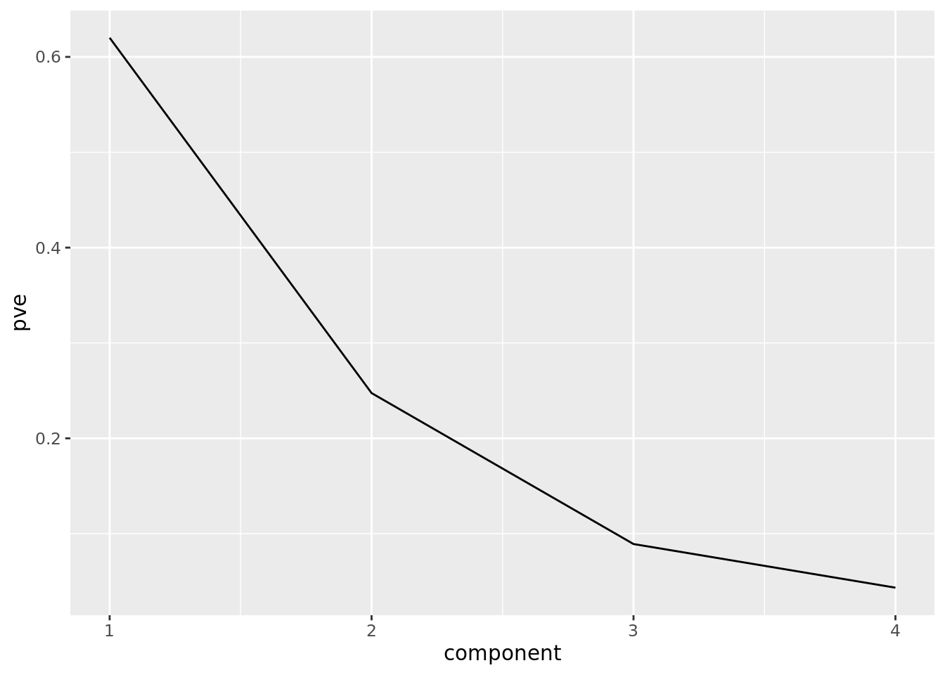
We can also plot the cumulative proportion of variance explained:
ggplot(pve) +
  geom_line(aes(component, cumsum(pve)))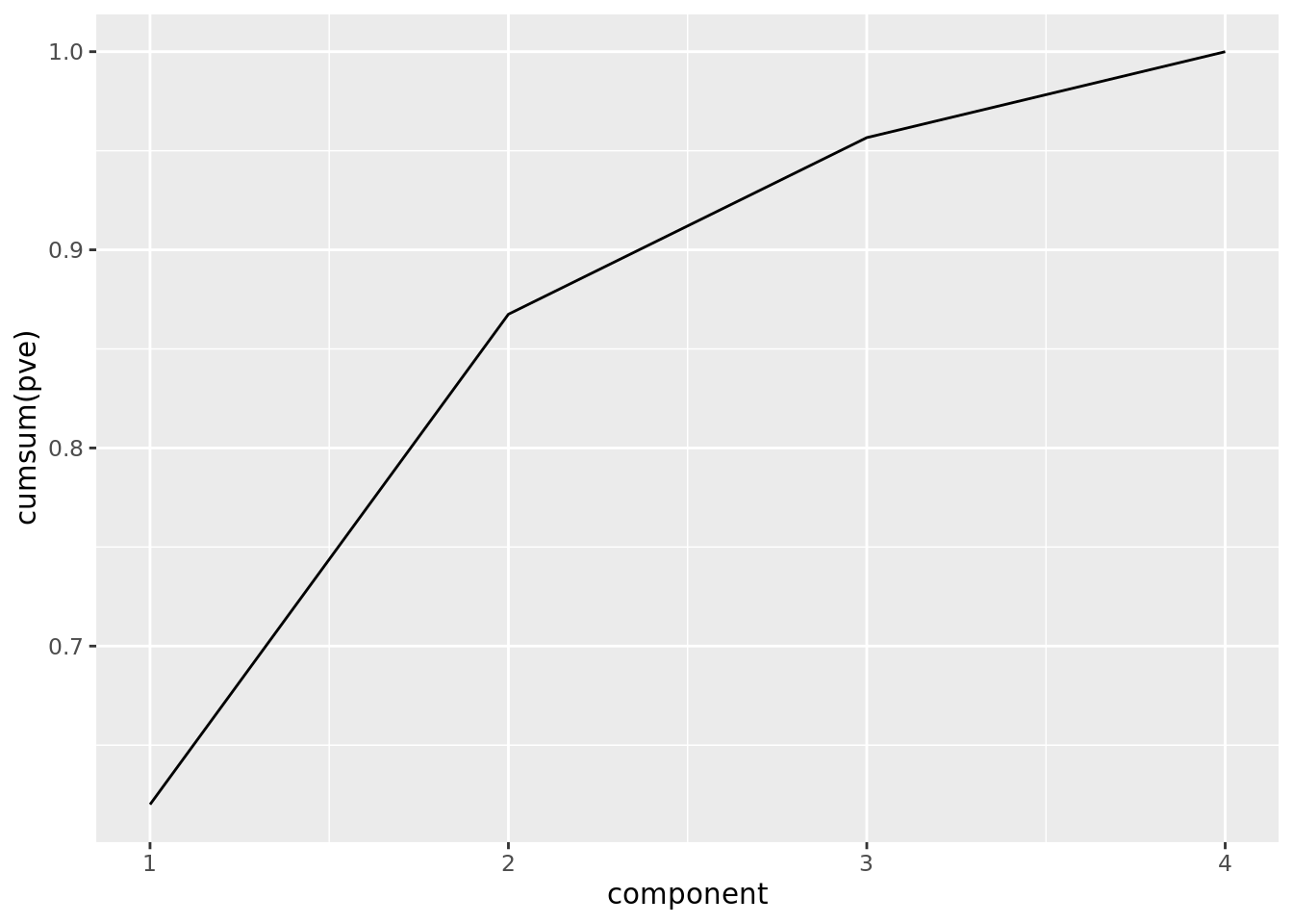
From this plot, we see that the first two PCs explain almost 90% of the total variation in the data.
10.3 Clustering
In this lab, we will look at three clustering algorithms: \(K\)-means, hierarchical, and spectral clustering. For each of these, we will use simulated datasets.
For each algorithm, different clusters are found depending on how many clusters you tell the algorithm to look for. Thus, while we are not “tuning” models with cross-validation (as we would with supervised learning problems), it can be worth fitting these algorithms assuming there are different numbers of clusters. Moreover, tidyverse provides a useful way to do this.
10.3.1 \(K\)-means
For \(K\)-means, we create a simulated dataset:
set.seed(2222222) # Glen Lerner

addvec = c(rep(3, 30),
           rnorm(40, 0.5, .25),
           rnorm(30, -1, 0.25),
           rep(4, 30),
           rnorm(40, 0.5, 0.25),
           rnorm(30, -1, 0.25))

dat1 = matrix(rnorm(100 * 2) + addvec,
              ncol = 2) %>%
    as_tibble() %>%
    set_colnames(c("x1", "x2"))
We can plot this dataset below. Note that none of the points are labeled as belonging to clusters, since we don’t know what cluster each point belongs to: this is an unsupervised learning problem. However, it would seem plausible from this plot that there are clusters to detect in this data.
ggplot(dat1) +
  geom_point(aes(x1, x2))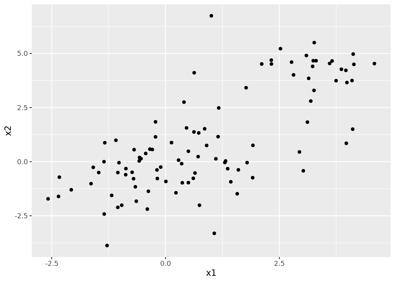
In order to run our \(K\)-means analysis, we will need helper functions. Unlike the previous labs, these are less about running the algorithm (i.e., fitting the model), and more about extracting elements of its results. Note that we define get_cluster() and plot_cluster() functions so that they can take either a \(K\)-means or spectral clustering object as input.
# Extract within-cluster SS from K-means object
get_within_ss <- function(kmean_obj){
  return(kmean_obj$tot.withinss)
}

# Get cluster labels for the data
get_cluster <- function(x, clust_obj){

  if(class(clust_obj) == "kmeans"){
    clust = clust_obj$cluster
  } else {
    clust = clust_obj
  }

  out = x %>%
    mutate(cluster = clust)

  return(out)
}

# Plot data with cluster labels
plot_cluster <- function(cluster_dat, title){

  plt = ggplot(cluster_dat) +
    geom_point(aes(x1, x2, color = factor(cluster)))

  return(plt)
}

# Add labels to plots
label_plot <- function(plot, title){

  return(plot + labs(title = title))
}
To actually run \(K\)-means, we need to specify how many clusters we should be looking for (i.e., how many centroids the algorithm uses). The idea of running the model over multiple parameters (i.e., numbers of clusters) should sound somewhat familiar, as the number of clusters is analogous to a tuning parameter. So, we can run \(K\)-means with several different numbers of clusters simultaneously using tidyverse:
dat_kmeans = tibble(xmat = list(dat1)) %>%
  crossing(nclust = 2:6)

dat_kmeans = dat_kmeans %>%
  mutate(kmean = map2(xmat, nclust, kmeans, nstart=20), # Fit K-means
         within_ss = map_dbl(kmean, get_within_ss), # Get within-cluster SS
         clusters = map2(xmat, kmean, get_cluster), # Get DFs with cluster affiliation
         plots = map(clusters, plot_cluster)) # Plot clusters
What we see from the results is that a greater number of clusters leads to a smaller within-cluster sum of squares. However, this should come as no surprise. In fact, if we set the number of clusters to the number of data points, then each data point would be its own cluster, which would mean that the within-cluster sum of squares would be zero! Thus, as you read this table, do not be tempted to simply look for the smallest within-cluster sum of squares; rather you should look for something of a diminishing return on adding more clusters, which can be seen more clearly in the plot. It looks as though more than four clusters may be less useful.
dat_kmeans %>% select(nclust, within_ss) %>%
kable()| nclust | within_ss |
|---|---|
| 2 | 267.1376 |
| 3 | 181.5454 |
| 4 | 142.8126 |
| 5 | 117.2232 |
| 6 | 96.9105 |
wss <- dat_kmeans %>%
  select(nclust, within_ss)

ggplot(wss) +
  geom_line(aes(nclust, within_ss))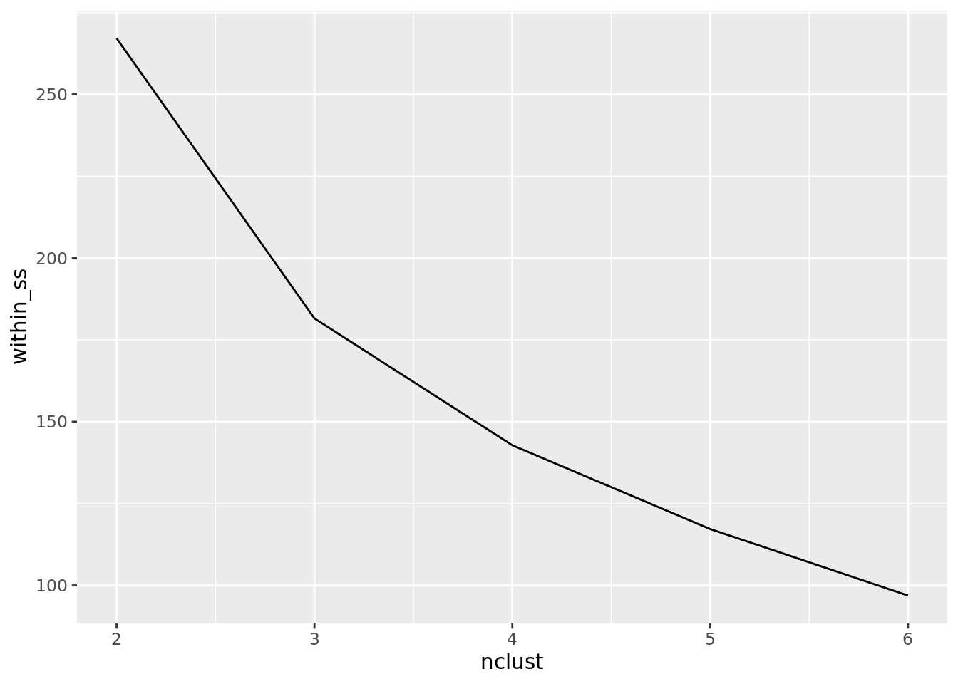
We can get an even clearer sense of this by plotting the full results of the \(K\)-means output. Below, we show plots for each number of clusters we used, and points are colored according to which cluster they belong to. Note that the cluster labels are not necessarily the same across plots.
grid.arrange(grobs = dat_kmeans$plots)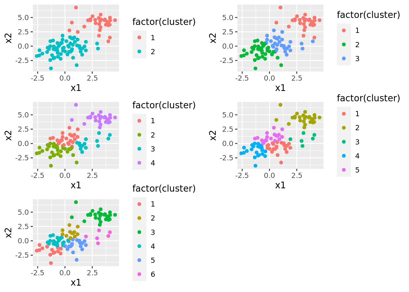
10.3.2 Hierarchical Clustering
To illustrate hierarchical clustering, we will use the same dataset as we did in the previous section. However, now we will need two important helper functions. The first runs the hierarchical clustering algorithm, which uses the hclust() function. Remember there are different methods for determining the similarity between clusters, thus hclus() takes a method argument.
run_hclust <- function(x, meth){
  return(hclust(dist(x), method = meth))
}
Remember, though, that this algorithm does not result in clusters, but rather in a dendogram. In order to get clusters from the dendogram, we have to figure out how to cut it. For that we use the cutree() function. It turns out we can specify two different ways to cut a dendogram with cutree(). In ISLR, they note that this is typically done using a specific height of the cut. One of the potentially frustrating aspects of this is that it can be difficult to look at a dendogram and figure out the correct height so that the cut results in a given number of clusters. Conveniently, cutree() allows us to specify the number of clusters we want to end up with, and it will automatically find the proper height for us. We use this approach in our helper function.
cut_hclust <- function(hclust_obj, ncuts){
  return(cutree(hclust_obj, ncuts))
}
Now that we have our helper function, we’re ready to start running them on our data. Remember that the results of hierarchical clustering can be sensitive to the measure of similarity used to construct the dendograms. Thus, we should set up a tibble so we can try a few different measures:
dat_hclust <- tibble(xmat = list(dat1)) %>%
  crossing(method = c("complete", "average", "single"))
Finally, we can obtain several different dendograms for our data. Note that there is a nice library for plotting dendograms that we use below.
dat_hclust <- dat_hclust %>%
  mutate(hcl = map2(xmat, method, run_hclust), # get dendos
         dendo = map(hcl, ggdendrogram)) # plot dendos

# Look at this dendo!
dat_hclust %>% pluck("dendo", 1)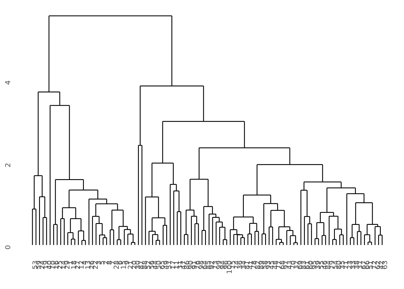
Now it’s time to cut some dendograms. In the code below, we try a few different cuts that result in different numbers of clusters. For each cut, we get the cluster data, plot it, and label it:
dat_hclust <- dat_hclust %>%
  crossing(ncuts = 2:5) %>%
  mutate(clusters = map2(hcl, ncuts, cut_hclust), # Cut dendo
         clust_dat = map2(xmat, clusters, get_cluster), # Get cluster info
         plots = map(clust_dat, plot_cluster), # Plot clusters
         titles = map2(method, ncuts, paste), # Get cluster labels
         plots_labeled = map2(plots, titles, label_plot)) %>% # Label cluster plots
  arrange(ncuts)
The results are summarized in the plots below. Each column shows the clusters for a given similarity measure (e.g., “complete”) and each row shows different numbers of clusters. We can see that the similarity measure can lead to very different clusters.
dat_hclust %>%
  filter(ncuts %in% c(2, 4)) %>%
  pluck("plots_labeled") %>%
  grid.arrange(grobs = ., ncol = 3)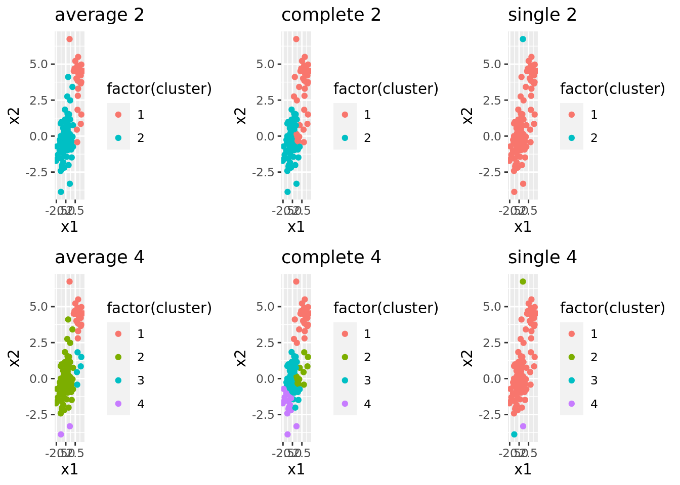
10.3.3 Spectral Clustering
For spectral clustering, we will be using another simulated dataset called “Spirals.”
spec_dat <- read_csv("./data/Spirals.csv")As can be seen in the plot below, there are clearly two different clusters, but it seems unlikely that we’d detect these with \(K\)-means.
ggplot(spec_dat) +
  geom_point(aes(x1, x2))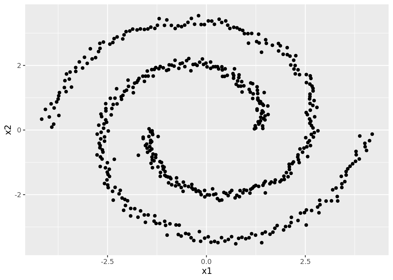
However, to illustrate the difference between \(K\)-means and spectral clustering, we’ll try running both. Since it’s clear there’s only two clusters, we’ll just try \(K\)-means with two clusters:
spclus <- tibble(data = list(spec_dat))

# Fit k-means w/ 2 clusters
spclus <- spclus %>%
  mutate(kmeans_2 = map(data, kmeans, centers = 2, nstart = 20))
Now we can turn to running a spectral clustering algorithm. The function used to fit these is specc(). This function takes a matrix or data frame to be clustered. It also takes a specific number of clusters, denoted by the centers argument. Finally, spectral clustering relies in part on something like the kernel trick. The idea is to examine similarity in a higher (potentially nonlinear) representation of the data, which we approximate with the kernel. Thus, we can specify a kernel argument within specc(), though the default is to use a radial kernel.
Here, we run spectral clustering with two clusters using the radial kernel:
# Fit a spectral cluster w/ 2 clusters
spclus <- spclus %>%
  mutate(spec = map(.x = data,
                    .f = function(x) specc(as.matrix(x), centers = 2)))
To compare how these perform, it helps to plot the clusters, which we do below:
spclus <- spclus %>%
  mutate(kmeans_clus_data = map2(data, kmeans_2, get_cluster),
         spec_clus_data = map2(data, spec, get_cluster),
         plot_kmeans = map(kmeans_clus_data, plot_cluster),
         plot_spec = map(spec_clus_data, plot_cluster))
Comparing the plots side-by-side, we see that \(K\)-means really just cuts the data in half linearly, while spectral clustering identifies what seems more intuitive and “correct”:
spclus %>%
  gather(model, plot, plot_kmeans, plot_spec) %>%
  select(model, plot) %>%
  mutate(plot_labeled = map2(.x = plot,
                             .y = model,
                             .f = function(x, y) return(x + theme(legend.position = "None") + labs(title = gsub("plot_", "", y))))) %>%
  pluck("plot_labeled") %>%
  grid.arrange(grobs = ., ncol = 2)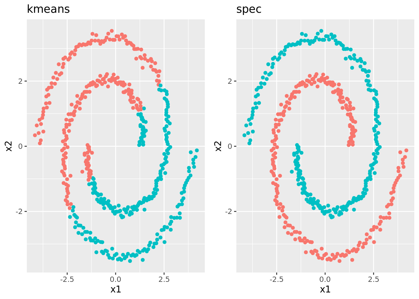
10.3.4 Extensions to Mixed-format Data
All of the clustering methods discussed in this lab rely on some measure of similarity between points in the data. For instance, \(K\)-means uses a Euclidean distance between points. However, distances are sensitive to the scale of each feature. This can be particularly important when the the features are of different types (i.e., some are factors, and some are continuous).
As an example, consider the following dataset. The variables in this data
mixt <- tibble(x1 = rnorm(100)) %>%
  mutate(x2 = rnorm(100, x1),
         x3 = rbinom(100, 3, exp(-0.25 + 0.8*x1 + 1.2*x2)/(1 + exp(-0.25 + 0.8*x1 + 1.2*x2)))) %>%
  mutate(x3 = factor(x3))

ggplot(mixt) +
  geom_point(aes(x1, x2)) +
  facet_grid(~x3)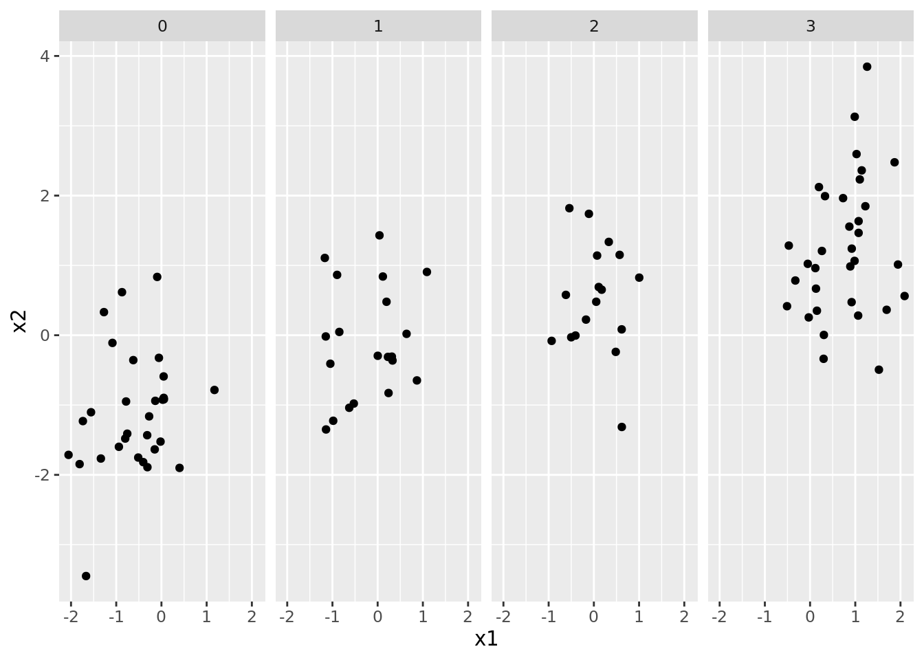
In order to deal this this, we have two options. The first is to simply scale all of the features so that they have roughly the same range and use the methods discussed in the previous setions. The alternative is to use methods and similarity metrics that are designed for mixed data types. The cluster package, for instance uses functions such as daisy() to compute dissimilarity on mixed data types using Gower distance. The output of daisy() is a matrix of dissimilarities between points, which are then fed to a function, such as pam() to cluster observations based on their dissimilarities. The code below implements this process on the mixt tibble to find \(k=3\) clusters:
library(cluster)

mixt_clusters <- tibble(dat = mixt %>% list()) %>%
  mutate(dissim = map(dat, daisy),
         clust = map(dissim, pam, k = 3))
As you finish this lab, consider working to answer the following questions:
- How might you expand this code to get different numbers of clusters?
- What sort of plots would you use to examine the clusters and their structure, and what code would you need to generate them?
- If you were to use simple \(K\)-means, how would you re-scale the data? Would you need to one-hot encode the categorical variable?
- How do the clusters obtained by \(K\)-means compare to the ones using
daisy()?